FandomMobile is the new mobile web experience we are rolling out to Gamepedia starting January 14th, 2021, following an opt-in beta period which began December 15th, 2020.
This is the first step towards an overall unified experience between Fandom and Gamepedia wikis (previously known as “Phase 2” of the Unified Community Platform), leveraging successful elements of both site experiences for admins, editors, and readers. As with the platform overall, your feedback factors into our development process, so please be sure to share it.
It is important to note that FandomMobile is customized with a different file set than the legacy mobile web skin. Please contact your Wiki Manager for help with any customization issues you may encounter.
If your wiki has not yet received the FandomMobile experience and you would like to test it, you may visit your user profile on a mobile device and use the toggle at the bottom to opt-in. The same toggle can be used to opt-out on wikis which have not been enrolled in the new experience.
Background
Mobile web is the most straightforward entry point into the new design process for two big reasons:
- Gamepedia’s experience is already based on MediaWiki’s mobile skin which provides us with the most solid technical foundation to build on.
- The impact of this work will reach the majority of our users, as an average of 56-64% of our total traffic comes from mobile devices each month.
While these designs will see some nice enhancements for mobile contributors as well (a group which is growing quite a bit with the new availability of mobile editing on the UCP for Fandom wikis), the main benefits will come in forms of readability, accessibility, and performance for all mobile users. Desktop designs will take more time and you will have an opportunity to provide early feedback on them as well down the road.
FandomMobile makes use of Gamepedia’s mobile web foundation, based on MediaWiki’s own mobile skin and MobileFrontend extension. By taking this approach, we gain benefits like…
- High amount of shared code with desktop experience
- Wikimedia Foundation updates
- Better performance than Fandom’s mobile web skin
- Support for all MediaWiki namespaces
On top of that foundation, we are able to bring Fandom-designed mobile enhancements like…
- Portable Infoboxes
- New mobile-friendly galleries
- Mobile-friendly tables
In building FandomMobile, we looked back to feedback we have heard over the years from both Fandom and Gamepedia users about the mobile web experiences, then iterated on design ideas with internal stakeholders from across the company, ultimately leading to what you get to test now. A recurring theme in feedback and conversations was the poor experience with how some elements transform when you move from desktop to mobile, particularly around images, infobox image cropping, gallery layouts, image captions, etc. These elements were presented in a manner which led to a bad experience for readers that could not be remedied by contributors, meaning it’s on Fandom to help fix that.
Let’s dive into some design mockups. Please note that these are not representative of the final implementation, were created in a design software with hilariously mismatched placeholder content, and were captured before the beta test in December went live.
Light and Dark Mode on Mobile
We get it. You want light mode and dark mode options. We agree. It’s a readability thing. We’re working to make this a reality for you. On Gamepedia, wikis using HydraDark on desktop will see the Gamepedia dark mode for their mobile experience.
The exact implementation beyond that is still up in the air, so we would love your feedback on this one: Do you want a per wiki toggle or a user preference to determine light vs dark mode? Let us know!
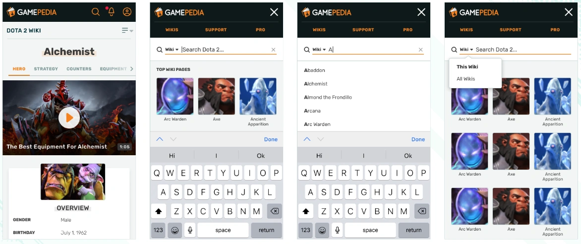
For the global navigation, we wanted invoking the search bar to be more than just search, but also invoke discovery options for what’s relevant on the particular wiki and the platform as a whole. The use cases we solved for were searching wiki content, discovering wiki content, and accessing global links. There were two options presented, the one you see above, which displays global links above the search bar and discovery options below it, and a second one which displayed a panel of global links underneath search before discovery options. The option we chose was the sleeker of the two and most respected the user’s intent, which was to search the wiki. You might notice the This Wiki vs All Wikis toggle in there. Our search tests concluded that offering this toggle was a good user experience, but we’re still collecting data and feedback about what its exact functionality should be. For now, it defaults to This Wiki for everyone.
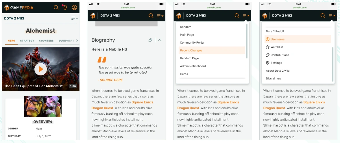
With local navigation, we wanted users to have access to what admins have put into the main navigation in an unobtrusive way, allowing them to get the most out of the content they’re consuming. The change here is a new unit displayed below global navigation that presents the community name and an entrypoint to open the Local Navigation. When the user starts scrolling down the page, Local Navigation & Global Navigation merge into one combined unit that allows for uninterrupted access to the main page of the wiki, Local Navigation, and Search (which invokes Global Navigation) even when the user scrolls down the page.
Table of Contents
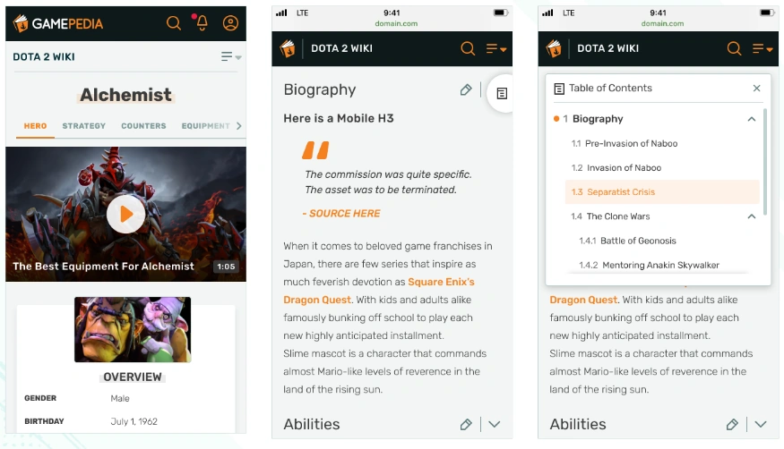
An article’s Table of Contents (ToC) is, as you know, a critical piece of the interface for communicating the overview of the content, showing how the content is organized, and navigating that content. On mobile, the ToC’s navigational role becomes more necessary, but its overview role could become borderline obtrusive if the user has to scroll past to reach the content. To solve for this, we looked at three different options:
- A ToC as part of the article page itself, beneath the infobox and introduction
- A floating ToC bar that scrolls with the user
- A floating ToC icon that scrolls with the user and can invoke the bar when pressed
The Growth and Design teams poured over these options and ended up selecting option 3, as it increases the utility of the ToC for navigational purposes while also making it more accessible to users as they read. We got some great feedback from the Wiki Managers and Content Team Members about how this is implemented in terms of both iconography and position, so we would love to hear your feedback on this as well!
Additionally, we are exploring the idea of changing the name from “Table of Contents” to “Page Contents,” to be more in line with Wikipedia and other sites.
Galleries
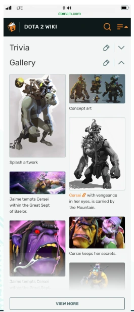
With Galleries, we heard loud and clear that there were two major issues with how Fandom galleries transform onto mobile: the lack of captions to provide necessary context and the mosaic layout skewing the priority of images. Again, we looked at 3 design options:
- A vertically-scrollable list of images with fixed width and variable height, displaying captions below the image.
- A vertically-scrollable mosaic of two image columns with variable height and fixed width, displaying captions below each image
- A vertically-scrollable mosaic of two image columns with fixed width and height, displaying captions below each image
The working group decided on option 2, which you see above with the funny mismatch of Dota 2 images and Game of Thrones captions. Option 2 provided the best mixture of image quality and quantity by not forcing a crop to conform with the fixed height but also showing images side by side. You’ll notice that caption display was a big priority for us, which was based on user feedback.
Lightbox
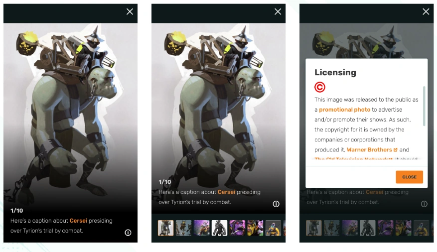
With the lightbox, we wanted to make sure that users got to engage with the larger image, read the caption, navigate to other images, and get useful information about the licensing (should it be relevant), an experience that does not occur at all on Gamepedia today and only partially on Fandom. Rather than send the user to a second page for license details, as we originally explored, we opted to make that experience a pop-under box that can be invoked with that information button to reduce the number of page visits required to find this information. Combined with the gallery enhancements, we think this is a great improvement, especially for communities with a lot of stills, screenshots, and artwork.
Customization
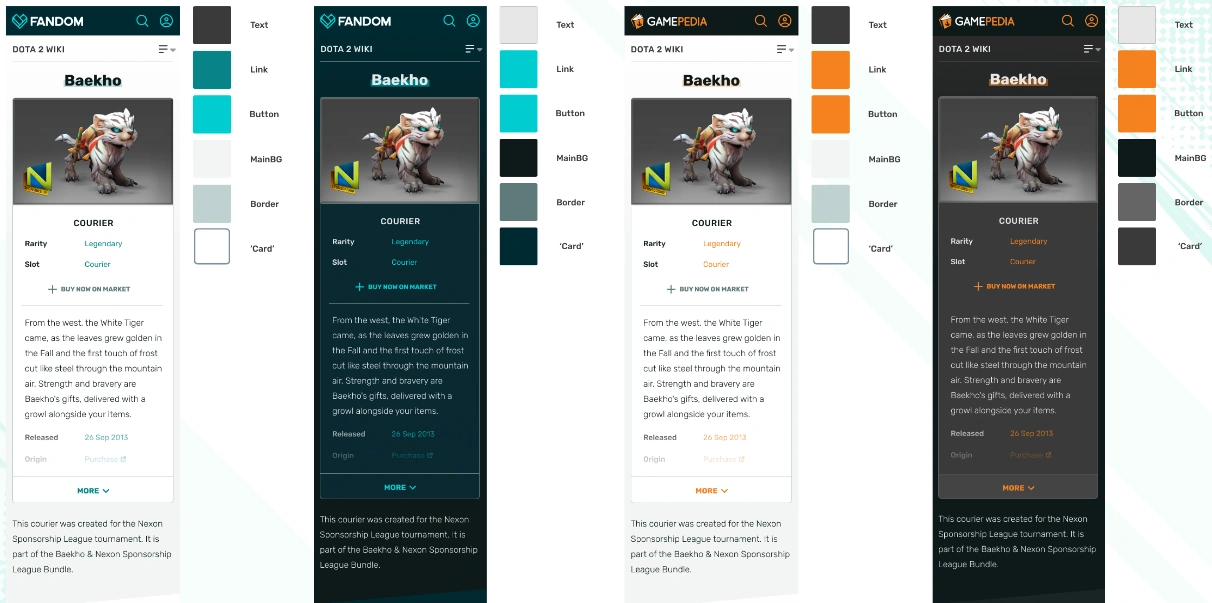
Expressing your wiki’s identity is a big deal for communities, with a marked gap between how it is done on Fandom and how it is done on Gamepedia. For Gamepedia wikis, the customization options are rather limited, compared to desktop, but we want to make sure that we can balance the expression with a good user experience. To that end, the JS and CSS files controlling the Gamepedia mobile look and feel on FandomMobile will be locked to Wiki Managers and up, at least for now, and Gadgets are being suppressed. Please contact them if you encounter any customization issues.
Unifying the theming experience between Fandom and Gamepedia is an ongoing conversation we’re having internally, so we’re limiting the scope of customization for the time being.
Feedback Collection
For submitting feedback on the beta experience, please contact your Wiki Manager, file a support ticket, or contact us on our official Discord server. We welcome your thoughts and constructive criticism on the future of wikis on mobile web!